A new surface deserves new principles
For twenty years, UI design optimized for one thing: reducing what the user has to think about. Hide the system, show the result. That assumption breaks the moment the system is an agent making decisions on the user's behalf. You cannot hide a coworker.
A2UI — Agent-to-User Interface — is the design discipline for surfaces where software is not just responding, but acting. Here is the working set of principles I keep returning to.
1. Observability over minimalism
A blank screen with one input box is the cleanest possible interface. It is also the most terrifying when an agent is doing work you cannot see. Show the steps. Show the tools being called. Show the intermediate state. Users do not need pixel-perfect minimalism; they need to trust the machine.
2. Reversibility as a first-class feature
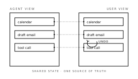
Every action an agent takes should be inspectable and undoable. "Send email" is a button on a normal app. In an A2UI it is a draft, a diff, a confirmation, and a 5-second undo. The cost of a wrong action is much higher when the user did not personally click each step.
3. Surface the model's uncertainty
Agents are confidently wrong by default. Good A2UI design exposes confidence — through hedged language, ranked options, "I'm not sure, here are two interpretations" patterns. Hiding uncertainty is a UX bug, not a UX feature.
4. Conversation is a control, not the product
Chat is a great fallback. It is a terrible primary surface for most work. Use chat for ambiguous intent; use structured UI — forms, tables, canvases — the moment the intent is clear. The best A2UIs collapse from chat into rich UI as soon as they can.
5. Generative UI must be legible
If the model can generate the UI, it can also generate a mess. Constrain the component vocabulary. Constrain the layout grid. The user should never wonder whether a strange-looking element is a real control or a hallucination.
6. Make interruption cheap
The user must be able to stop, redirect, or correct the agent at any moment without losing context. A "stop" button is the floor. A "stop and tell it what to do differently" affordance is the ceiling.
7. State is shared, not hidden
The agent's view of the world and the user's view of the world should be the same view. If the agent thinks the calendar is empty and the user knows it is not, that gap is where every bad outcome lives. Render the agent's working state, and let the user edit it.
The shift
Responsive design taught us to adapt to screens. A2UI asks us to adapt to autonomy. The interfaces that win the next decade will not be the prettiest. They will be the ones where the human and the agent can always see what the other is doing.
— Aadhar